My top 5 tips for customising your Squarespace template
I thought I’d follow up my previous post about whether custom website design or using a Squarespace template is best for your business with my top tips for actually customising a Squarespace template.
Whether you’re starting from a built-in Squarespace template or you’ve purchased a premium / designer template, I’ve got you.
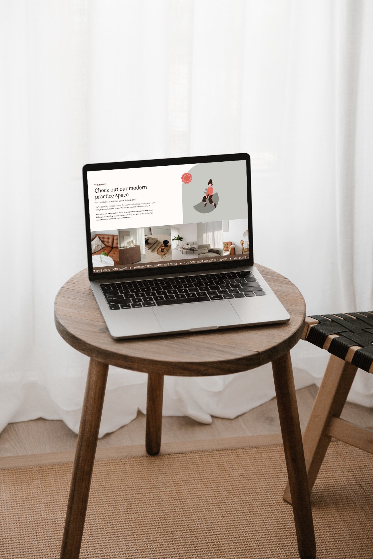
If you’ve already started customising your Squarespace template, you may have noticed that once you’ve replaced the demo content with your own that it just doesn’t look quite the same, but you’re scratching your head as to why.
You might be surprised by the amount of work that goes into creating a template so it looks the way it does by the time you see it - and there are a lot of elements that play into it. Here are some of the most common things to look out for when creating your website from a template to keep it looking great and matching your brand.
1. Text
One of the biggest things to look out for when first selecting a template is to take note of how much text is in each section and what shape any images are. For example, if the About section on your template home page is just a short paragraph with a square photo but you’ve added in four paragraphs and a landscape photo, it’s likely that the page (or at least that section) won’t ‘balance’ and will look off.
That’s because templates are designed in a particular way to best showcase the content that’s in there. So what does that mean for you? If you’ve added your content in and you’re not loving the results, go back to the original template version and take a close look at the layout. Note, unless you have a screenshot or backup, it may be easiest to go to the Squarespace designer’s website and view the template in their shop! From here, it will give you an idea of the amount of content you should have in yours to keep the designed layout.
Beware: you’ll probably have to reduce a lot of your text! This is usually the hardest part 😉
2. Images
Notice how in the template everything just seems to flow? If you have a closer look at all the images, you’ll notice that they’ll all have a similar feel to them, whether it’s a colour / filter or general style. Even if the images differ a fair bit, you’ll notice at least that they’re all a warm tone or cool tone, or maybe even black and white.
Before you start replacing the template images with your own, take some time to go through what you want to use and plan it out. Do your images complement each other? When you have them all in the same spot, does one of them look like the odd one out? If so, it’s a good opportunity now to find one that fits better.
If you have professional branding photos, it’s the perfect time to put them to use as your photographer will have used a consistent style throughout.
If you’ll be using a mix of your own photos and / or stock photos, that’s fine too - but it will be worth your while to ensure they’re all edited in a similar way! One of the biggest mistakes when using stock photos is using it exactly as downloaded. If you edit your own photos in Lightroom or VSCO for example, make sure you do the same with the stock photos you’re using. This will ensure everything has a consistent look on your site and there’s no jarring images that don’t look like they should be there.
3. Colour palette
One of the first things you might want to do with your template is jump in and add all your branding colours. Before you do, check out the template really carefully: notice where dark and light colours have been used, how different colours have been paired, the contrast between the text and backgrounds, etc.
When you go to replace your colours in your website’s Site Styles section, make sure you replace like colours so your design still works as intended.
What does that mean?
If you’re replacing a dark colour that is used for text in the template, make sure you replace it with your dark brand colour that’s used for text; if you replace it with something pale, all instances of that dark text on your website will likely now be illegible on the background colour that’s set. Yikes!
In Squarespace, the colour palette is split into 5 colours. While you can add more colours if you start editing individual elements, the main palette is made up of colours in the following order:
Lightest (e.g. white, for backgrounds or on dark backgrounds)
Light (e.g. a coloured background that still pairs with dark text)
Bright (e.g. an accent colour)
Dark (e.g. a darker accent colour or background)
Darkest (e.g. black, for text on light backgrounds)
You will save yourself a HUGE headache if you update your colours in this way also, otherwise you’ll be stuck going in and updating every single element to get it to work.
4. Fonts
These days Squarespace has a great range of fonts available to use that are already built in. If you already have brand fonts, be sure to add these in; if they’re not available in Squarespace, you can upload them as custom fonts using the Custom CSS feature. If you’re wondering how to add custom fonts to your site, Becca at Inside The Square has a tutorial on how to upload custom fonts to Squarespace (as well as many other great tutorials!).
Again though, before jumping in and changing all the fonts, have a look at how the current ones are used in your template.
Are certain headings all caps? Is there strategic use of italics to change up the look of different sections? Are buttons styled in a different way so they stand out?
Keep all this in mind as you change fonts around. If you’re just not feeling the template fonts but you don’t have your own specific brand fonts, have a look at the font packs in Squarespace’s site styles before changing any individual fonts. Font packs have been specifically curated by the folk at Squarespace to make sure the heading and paragraph type works well together. You can choose from a number of styles in either sans serif, serif or a mix of the two.
5. General styling
Happy with your new website but still feel like there’s something missing? Jump onto Pinterest! Find website designs that you love and ask yourself what it is about them that you’re most drawn to. Is it the way that fonts have been paired together, or how a background image has been used? See if you can take some inspiration from it and incorporate it into your own website.
Note: this can be a lot harder than it looks!
You definitely don’t want to outright copy someone else’s design, and at the same time, you want to be sure that what you’re adding is going to mesh with the rest of your site. While you might love a hot pink accent you’ve seen on a website, adding a hot pink background to your website when the rest is beachy neutrals isn’t going to work!
Sometimes this can all be trial and error, and sometimes it’s best to stick to the template design as close as you can. If you’re really keen to do something different with your site but can’t get it there on your own (or you’re happy to outsource what would be yet another task on your to-do list), feel free to reach out - I’d love to chat about how we can work together on a custom Squarespace design for you.
Have you customised your own website template? What’s the biggest tip you have for someone about to do the same? Let me know below or come and share on Instagram!